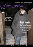
Above are my copies of my magazines in progress. On the far left is my Prelim task - the sixth form magazine. From this i got varied feedback about my design. My target audience said that because of the colour scheme of my magazine it looks feminine and not unisex. So i improved and acted on my audiences feedback by picking colours with are not sex orientated. So i chose colours like reds and black, which are more male orientated. But that's because my magazine is more male orientated. Unlike the Sixth form magazine which is unisex.
My Draft version of my music magazine, is very unconventional and doesn't stick to main conventions. However, personally i thought my magazine was interesting to look at and different. My target audience said that it didn't look like a magazine and the picture looked odd, because of the front model. So by changing the main image and making it look more conventional by using the standard layout for a magazine it looks more believable.
My final version of my magazine, taking into account everything that my target audience said. I chose colours and images to link in with both sexes. Also i used all the main conventions. Such as a masthead at the top and the converlines in the middle. However, my menu strip is in the same place as in my draft because i like the look of the strip at the bottom. So this is not really conventional but the design feature looks quite good.


No comments:
Post a Comment